
What Big Macs, Waffle House, and Strippers teach us about unconventional health checks [Math Mondays]
Beyond Traditional Benchmarks: How Economists Measure the health of Economies with 3 unconventional metrics

Hey, it’s your favorite cult leader here 🦹♂️🦹♂️
Mondays are dedicated to theoretical concepts. We’ll cover ideas in Computer Science💻💻, math, software engineering, and much more. Use these days to strengthen your grip on the fundamentals and 10x your skills 🚀🚀..
I put a lot of effort into creating work that is informative, useful, and independent from undue influence. If you’d like to support my writing, please consider becoming a paid subscriber to this newsletter. Doing so helps me put more effort into writing/research, reach more people, and supports my crippling chocolate milk addiction. Help me democratize the most important ideas in AI Research and Engineering to over 100K readers weekly. You can use the following for an email template.
PS- We follow a “pay what you can” model, which allows you to support within your means, and support my mission of providing high-quality technical education to everyone for less than the price of a cup of coffee. Check out this post for more details and to find a plan that works for you.
All the conversations around Llama 4 (read the breakdown of it’s architecture here), potentially gaming benchmarks, had me thinking about the role of benchmarks. Usually, the things we want to actually measure tend to be are very hard to track (quality of generations of LLMs)- so we rely on specific benchmarks that try to approximate them (LMSys, Perplexity, etc). However, over-engineering for the benchmarks can often lead to very distorted outcomes (we’ve touched on Goodhart’s Law many times)-
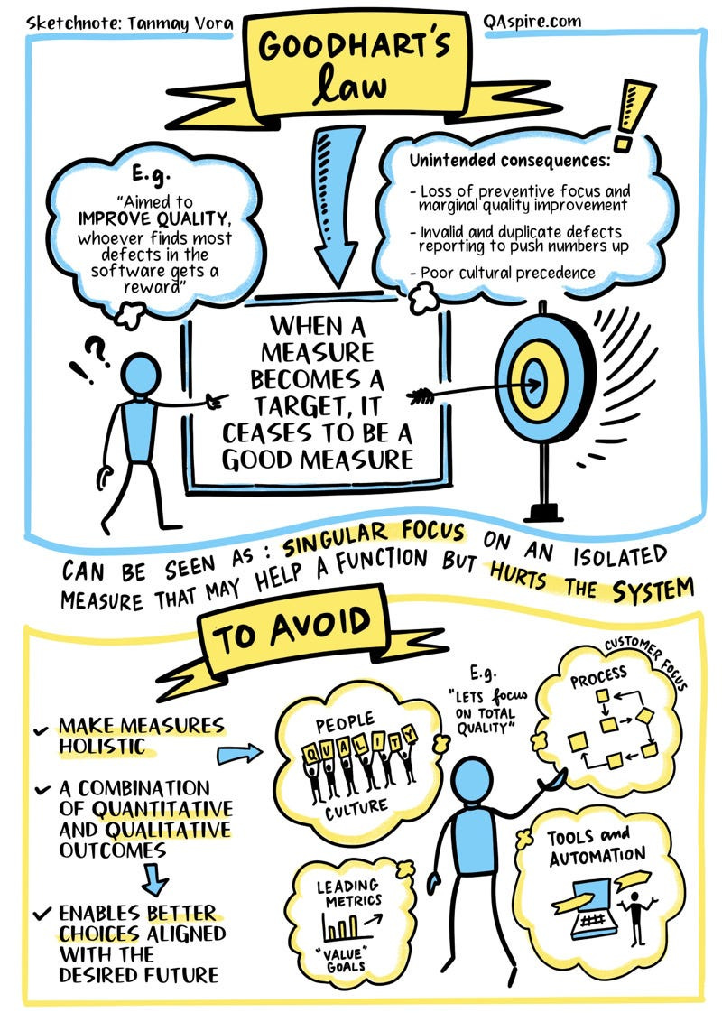
For example, we Engineers managing complex distributed systems rely on dashboards and key performance indicators (KPIs) — abstractions like CPU load or API latency — to gauge health without inspecting every component. These are proxies, imperfect but essential signals. While these can be useful, it’s also important to remember that all benchmarks have their limitations. System-wide thinking and having a sense of proportion is key for this development.
I’ve found that the best way to pick up these skills is to look at other fields that deal with them and see how they fix them. Economics is a prime candidate for this field b/c it faces the same issues as tech, only on a much larger scale. This is why I’ve taken a passive interest to studying how economists measure growth etc-
Satellite images of nighttime lights have contributed to our understanding of economic activity for more than a decade. For example, nighttime lights can help approximate economic activity in small spatial units over time…
Early publications have demonstrated powerful applications of this new data to economics. Studies of natural disasters, lockdown measures during the COVID-19 pandemic, domestic policy measures (such as demonetization in India), and trade shocks (such as tariff escalation between China and the United States) have all been undertaken using nighttime light data.
In this article, I will explore 3 unconventional (but very interesting) signals that people might use to measure different economic patterns. Hopefully, these can track some sparks on how you might measure the performance and avoid the pitfalls many engineers/managers/investors make by focusing on the wrong things-
First of all, he clearly states what were his drivers: the metrics he objectively measures and he thinks show he has made progress with the decision made.
Time to first response
Resolution time
Customer support costs
All of those metrics are important. But do you see the pattern there? Those are Customer Support metrics, not Customer Experience ones! All of them are inward facing (looking at the organization), instead of outward facing (looking at the customer). Yes, collecting Customer Experience data is harder than collecting Customer Support data. But it is indispensable, or you might end up shooting yourself in the foot. To do a proper analysis, we must follow the entrepreneur’s reasoning, so let’s keep going.
- “How NOT to apply Artificial Intelligence in your business” is a great article on why so much “AI for Customer Service” goes wrong b/c it tracks wrong metrics.
Let’s have some fun.
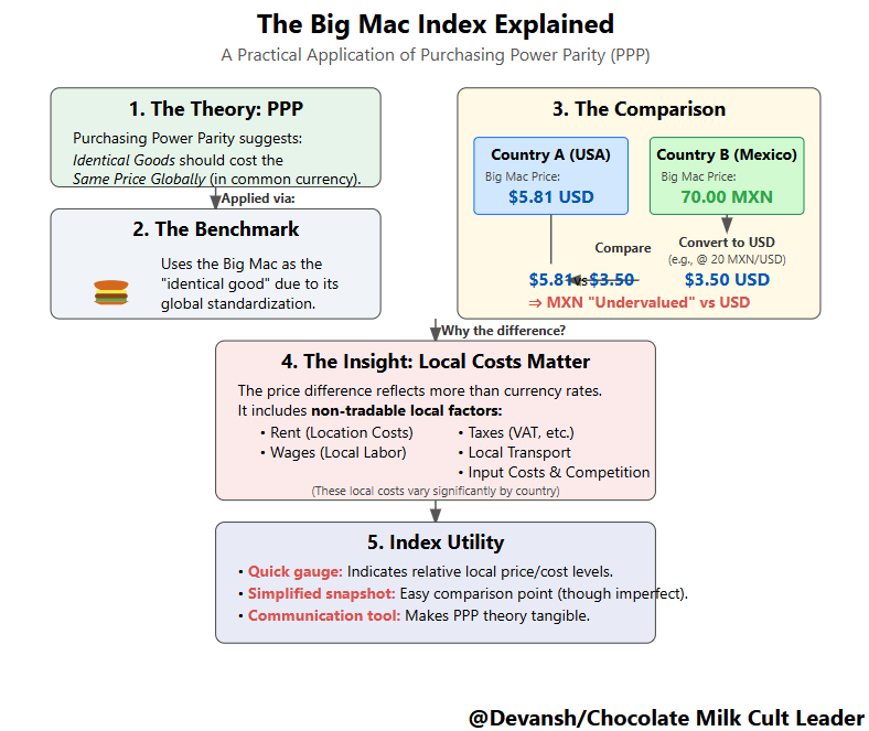
1. The Big Mac Index: A Global Pricing Benchmark in Your Lunch Bag
At its heart, the Big Mac Index, created by The Economist, is a clever application of the economic theory of Purchasing Power Parity (PPP). PPP suggests that identical goods should eventually cost the same in different countries when prices are expressed in a common currency, assuming frictionless trade. Think of it like the law of one price applied globally — if compute time is drastically cheaper in one cloud region than another after currency conversion, market forces (demand shifting to the cheaper region) should theoretically push prices or exchange rates towards equilibrium.
The Big Mac Index simplifies the “identical goods” basket to McDonald’s signature burger, leveraging its (mostly) standardized ingredients and global ubiquity. By comparing the local price of a Big Mac (converted to USD) in, say, Mexico versus the US, the index provides a quick heuristic: is the Peso undervalued or overvalued against the Dollar relative to the cost of this specific item? If the Mexican Big Mac is cheaper in USD, the Peso is deemed “undervalued” by this measure.
This simple comparison immediately reveals insights relevant across domains:
Why it Deviates is the Story: The index rarely shows perfect parity, and that’s where it gets interesting. A Big Mac isn’t just globally sourced ingredients; its price heavily reflects local, non-tradable costs: rent in prime locations, wages driven by local labor laws, taxes, domestic transportation, and competition intensity. It’s analogous to why deploying the same software stack costs differently across cloud providers or regions — local energy, real estate for data centers, and labor costs for support staff fundamentally alter the final price, even if the core “service” seems identical. The Big Mac Index, therefore, acts less as a pure currency valuation tool and more as a rough gauge of these combined local cost structures relative to the US- which can be incredibly useful itself.
A Lossy Compression of Economic Data: For investors or businesses considering international operations, it offers a highly simplified, “lossy” snapshot of relative price levels. Think of it like using a single, well-known benchmark score to quickly compare different processors. It doesn’t tell the whole story (power consumption, specific workload performance), but it provides a starting point and highlights potential anomalies — is a currency truly “cheap,” or are local operating costs just significantly lower (or higher)? This can flag areas needing deeper due diligence.
Communication Power: Its simplicity makes complex ideas like PPP and exchange rate misalignment accessible, serving as a powerful communication tool for economists and policymakers explaining global economic landscapes.
This isn’t the only fast food-related index, interestingly. If you’re looking to date an economist, looks like you ditch the library for the Fast Food chain. Let’s talk move on to this one next-
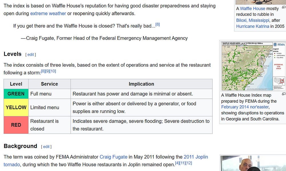
2. The Waffle House Index: Real-Time Disaster Monitoring via Resilient Operations
Imagine a critical service in your distributed system known for its exceptional uptime and resilience — perhaps your core authentication service or a foundational database cluster. If that service goes down, it signals a severe, likely widespread problem affecting the underlying infrastructure. The Waffle House Index (WHI) operates on this exact principle, leveraging the renowned disaster preparedness of the Waffle House restaurant chain as a real-time proxy for community functionality after events like hurricanes.
In case you think I’m making this up- FEMA ( Federal Emergency Management Agency) informally uses their status as an immediate ground-level indicator and there’s a whole Wikipedia article dedicated to the WHI:
Green (Full Menu): Like a system operating nominally. Power is likely on, roads are passable enough for staff and supply trucks, minimal disruption.
Yellow (Limited Menu): Degraded performance. Running on generators, potential supply chain hiccups, partial staffing. Signals significant disruption (e.g., widespread power outages) but core operations continue.
Red (Closed): Critical failure. Severe damage prevents operation, indicating major infrastructure damage (impassable roads, safety hazards, structural damage) in the immediate vicinity.
The WHI’s value stems from its characteristics:
Real-Time Sentinel: In the chaotic aftermath of a disaster, official assessments take time. Waffle House’s status provides an immediate, hyperlocal signal. A “Red” status is a high-fidelity indicator that this specific area needs urgent attention, much like a critical alert from a key monitoring system demands immediate engineering response.
Proxy for Infrastructure Health: Its operational capability directly reflects the state of essential local infrastructure — power, water, transportation, and basic safety. For FEMA, a map of Waffle House statuses becomes a rapid, preliminary damage map, guiding resource allocation to the hardest-hit zones before detailed surveys are complete.
Leveraging Predictability: It demonstrates how the predictable, resilient behavior of a private entity can serve as a reliable data point for public sector emergency management. Investors in sectors like insurance, logistics, or retail with exposure to disaster-prone regions might also find it a useful, though informal, real-time gauge of event severity and potential business interruption.
Next is my favorite index of the 3, just because of how unintuitive but brilliant it is-
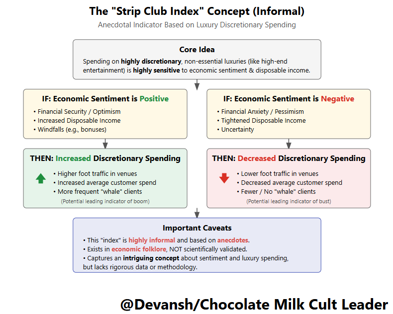
3. The Stripper Index: Probing the Frontiers of Discretionary Spending Sentiment
This index is the most informal and least scientifically validated, existing largely in the realm of anecdote and economic folklore. However, the concept it tries to capture is fascinating: the idea that spending patterns in certain highly discretionary, luxury-oriented sectors might act as a sensitive leading indicator of economic shifts or changes in consumer sentiment, particularly among specific demographics.
The hypothesis runs like this: When people feel financially secure, optimistic, or experience sudden windfalls (like large bonuses in finance), spending on non-essential, often impulsive luxuries like high-end entertainment (strip clubs being one frequently cited example) tends to increase. Conversely, when economic anxiety rises or disposable income tightens, this type of spending is often one of the first things cut back. This becomes particularly intersting. Anecdotes surface during booms and busts regarding changes in foot traffic, average customer spend, or even the frequency of “whale” clients in such venues.
The Stripper Index — named for how it relates the revenue generated by strippers’ cash tips to the financial strain of consumers and the current economic cycle — though it encompasses all forms of sexual labor, has been mostly a joke to economists as they continue to explore different methods of predicting the economy. However, when X user and stripper @botticellibimbo correctly predicted the economic decline in 2022 based on her recent profits at work, economists began to examine the Stripper Index more closely.
Though the relationship between the direction of the economy and the earnings of the sex industry depicted in the Stripper Index may initially seem arbitrary, economists can look to the decline in discretionary income during economic strain for evidence of the correlation.
Discretionary income is the portion of an individual’s income that remains after covering all necessary expenses, such as housing, taxes, and utilities. Consumers can then use this income by saving or by spending on non-essentials as they see fit. Common expenses classified as discretionary include entertainment, vacations, and hobbies, all not required for living and participating in society. Payments on products of the sex industry, from strip clubs to escort services, would fall under non-essential or discretionary purchases.
-The Stripper Index: Decoding the Economic Signals of Sex Work, a Berkely Publication talking about this, in case you think I’m making this up.
Exploring this concept, even acknowledging its limitations, is worthwhile:
Sensitivity to Sentiment Swings: The appeal lies in its potential sensitivity. Unlike mortgage payments or utility bills, spending on high-end entertainment is highly elastic and closely tied to immediate financial well-being and confidence. It’s like monitoring subtle shifts in user engagement metrics (e.g., time spent on optional features, frequency of cosmetic purchases in a game) that might signal changing user satisfaction or predict future churn before subscription cancellations actually occur. These are faint, early signals.

Potential Leading Edge: Because these cuts (or splurges) can happen quickly in response to perceived economic changes (job insecurity, market volatility, bonus news), they could theoretically precede broader shifts in consumer behavior captured by lagging official statistics like retail sales. Doubly so if the Stripe Club services a lot of finance and/or policy people, whose work it is to predict the future and act accordingly.
The Measurement Challenge: The primary obstacle is the lack of reliable, standardized data. The “index” relies on scattered anecdotes, making it impossible to systematically track, verify, or compare over time or across locations. What constitutes a “signal”? A 10% drop in Tuesday night traffic in one club? A change in the average tip amount reported by a few workers? The ambiguity and potential for bias are enormous. Furthermore, numerous confounding factors influence this specific industry — local events, competition, marketing, changing social norms, regulatory shifts — making it extremely difficult to isolate a pure macroeconomic signal.
Niche Indicator at Best: Even if measurable, it would reflect the sentiment and spending power of a relatively narrow segment of the population, not the economy as a whole. It’s akin to drawing broad conclusions about internet health based solely on traffic patterns for a specific high-end gaming service — potentially interesting for that niche, but not a general indicator.
While lacking the rigor of the Big Mac or the practical application of the Waffle House Index, the Stripper Index persists in discussion because it touches on the hunt for leading indicators hidden within volatile, sentiment-driven corners of the economy. It highlights the challenge and allure of capturing those very first whispers of change, even if the methods remain elusive and the signals noisy.
To me, these indexes serve as reminders. We constantly rely on proxies and simplified signals to navigate complexity. The key is to critically assess them: What exactly is this metric measuring? What are its inherent assumptions and limitations? In what context is it actually useful? How reliable and quantifiable is the data? The art lies in choosing the right proxy for the task and understanding the story it truly tells.
Hopefully, this gave you some ideas on how you might add more dimensions to your evaluations (or atleast I hope it was interesting to read through).
What are some ways you measure performance in complex systems? Would love to hear it.
Thank you for reading and hope you have a wonderful day.
Dev <3.
I put a lot of work into writing this newsletter. To do so, I rely on you for support. If a few more people choose to become paid subscribers, the Chocolate Milk Cult can continue to provide high-quality and accessible education and opportunities to anyone who needs it. If you think this mission is worth contributing to, please consider a premium subscription. You can do so for less than the cost of a Netflix Subscription (pay what you want here).
If you liked this article and wish to share it, please refer to the following guidelines.
That is it for this piece. I appreciate your time. As always, if you’re interested in working with me or checking out my other work, my links will be at the end of this email/post. And if you found value in this write-up, I would appreciate you sharing it with more people. It is word-of-mouth referrals like yours that help me grow.

Reach out to me
Use the links below to check out my other content, learn more about tutoring, reach out to me about projects, or just to say hi.
Small Snippets about Tech, AI and Machine Learning over here
AI Newsletter- https://artificialintelligencemadesimple.substack.com/
My grandma’s favorite Tech Newsletter- https://codinginterviewsmadesimple.substack.com/
My (imaginary) sister’s favorite MLOps Podcast (here)-
Check out my other articles on Medium. : https://rb.gy/zn1aiu
My YouTube: https://rb.gy/88iwdd
Reach out to me on LinkedIn. Let’s connect: https://rb.gy/m5ok2y
My Instagram: https://rb.gy/gmvuy9
My Twitter: https://twitter.com/Machine01776819